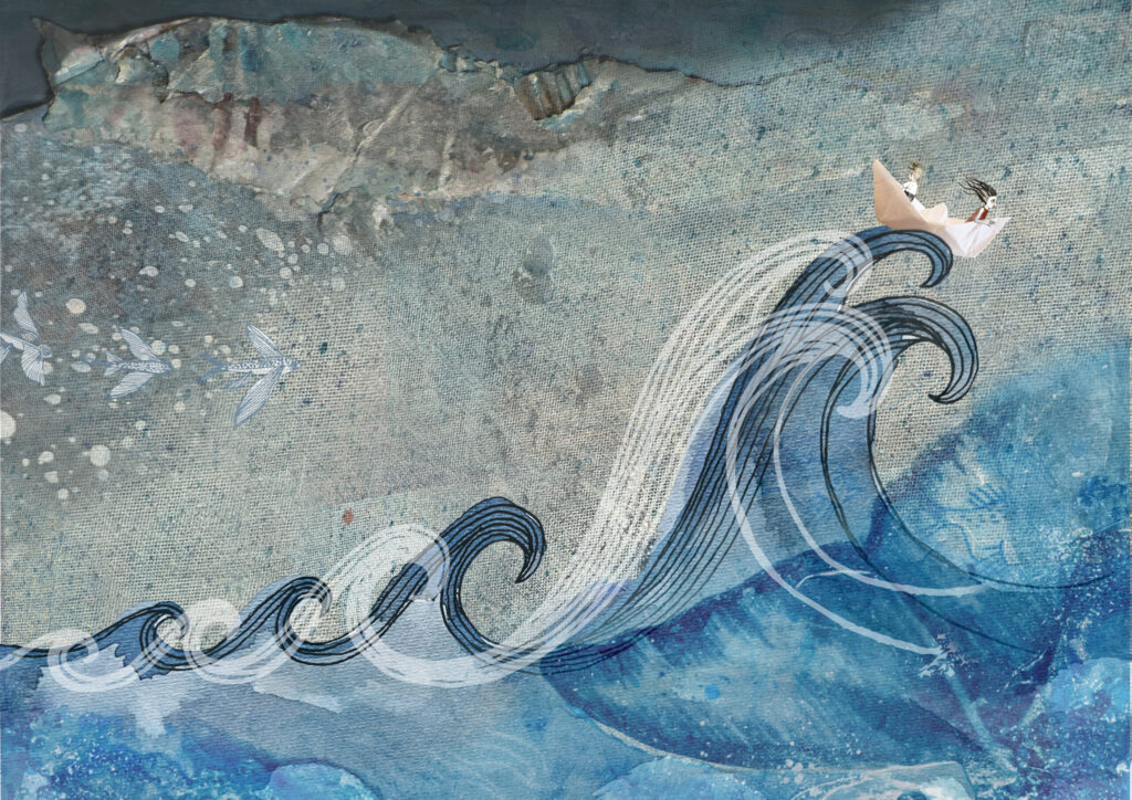
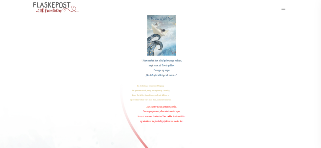
“Et hav af folelser” (eng. An ocean of emotions) is a non-digital teaching concept, ran by Aarhus Musikskole. The project aims to help children to navigate their emotions through music, storytelling and other artistic expressions.
It wasn’t doing justice to the magical, meaningful initiative it represented. Parents, teachers, and even potential partners landed on the site but often left scratching their heads – what is this project about? Why does it matter? How can I be part of it? That’s where I stepped in. My mission: redesign the website into an intuitive, and visually cohesive platform that feels like stepping into a book but communicates the concept instantly and guides visitors to what they are searching for.
First
I worked with the client to brainstorm ideas.
Then
Helped to
decide
which concepts followed UX best practices.
Goals and Vision
Engagement
Build a site that teachers, parents, and partners actually want to use.
Clarity
Homepage must immediately communicate the project’s relevance and visual identity.
Usability
Navigation that’s intuitive, accessible, and effortless.
Consistent branding
A comprehensive, reusable branding, reflecting the project.
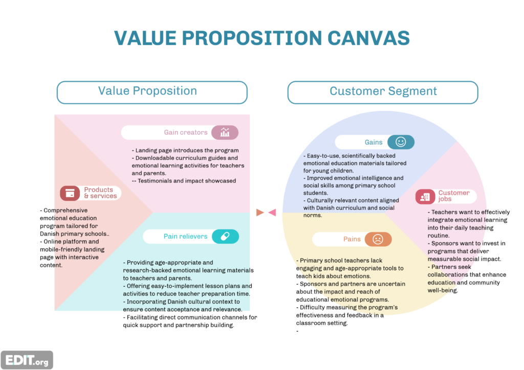
Target Segent 1
Parents and educators
Need a clear “Why” statement
Want to learn about implementation
Quickly access needed materials
Target segment 2
Sponsors and partners
Need to understand relevance and impact
Want to quickly learn about vision
Should feel that it’s credible and progressing
Primary and secondary research
Desk research and interviews defined a clear, visually strong design direction.
Wireframes and user flow
The design process started with defining structure and content.
When the architecture of the website was decided I sketched out wireframes and first written content draft. Then involved PM to collaborate on iterations and help to refine content itself (as an intern I wasn’t fully cognizant of the product).
The wireframes in the images are from the early stages and shows how much the design evolved.
Prototype development
Wireframes were brought to life adding branding and interactions.
User testing
Testing prototype among target group suggested additional page for teachers.
Although I did not have access to some of the target segments like sponsors and parents, testing on teachers did resulted in a future iteration of adding a separate page for teachers to access additional materials, organized in a convenient way to prepare for classes. When continuing a partnership with Aarhus Musikskole for the Thesis Project, this problem became the focus point.
Testing also revealed some interaction inconveniences in material page, where navigating between chapters lacked smoothness.